

Usage
The Usage page measures how your organization adopts FastQuery. Open it from the navigation menu. Five summary tiles sit at the top:
- Members — the number of people in your organization.
- Active last 30 days — the share of people who used FastQuery in the last 30 days.
- Installed — the share of people who installed the app.
- Profile created — the share of people who completed their profile.
- App opens · 12 weeks — the total app opens, with a 12-week trend line.
Below the tiles, a grid shows one row per facility. Expand a row to see each person at that facility. The columns show install, profile, and activity rates, plus app opens and completed tasks for the last 30 days. Rates are color-coded. Green is good. Red needs attention. A totals row sits at the bottom.
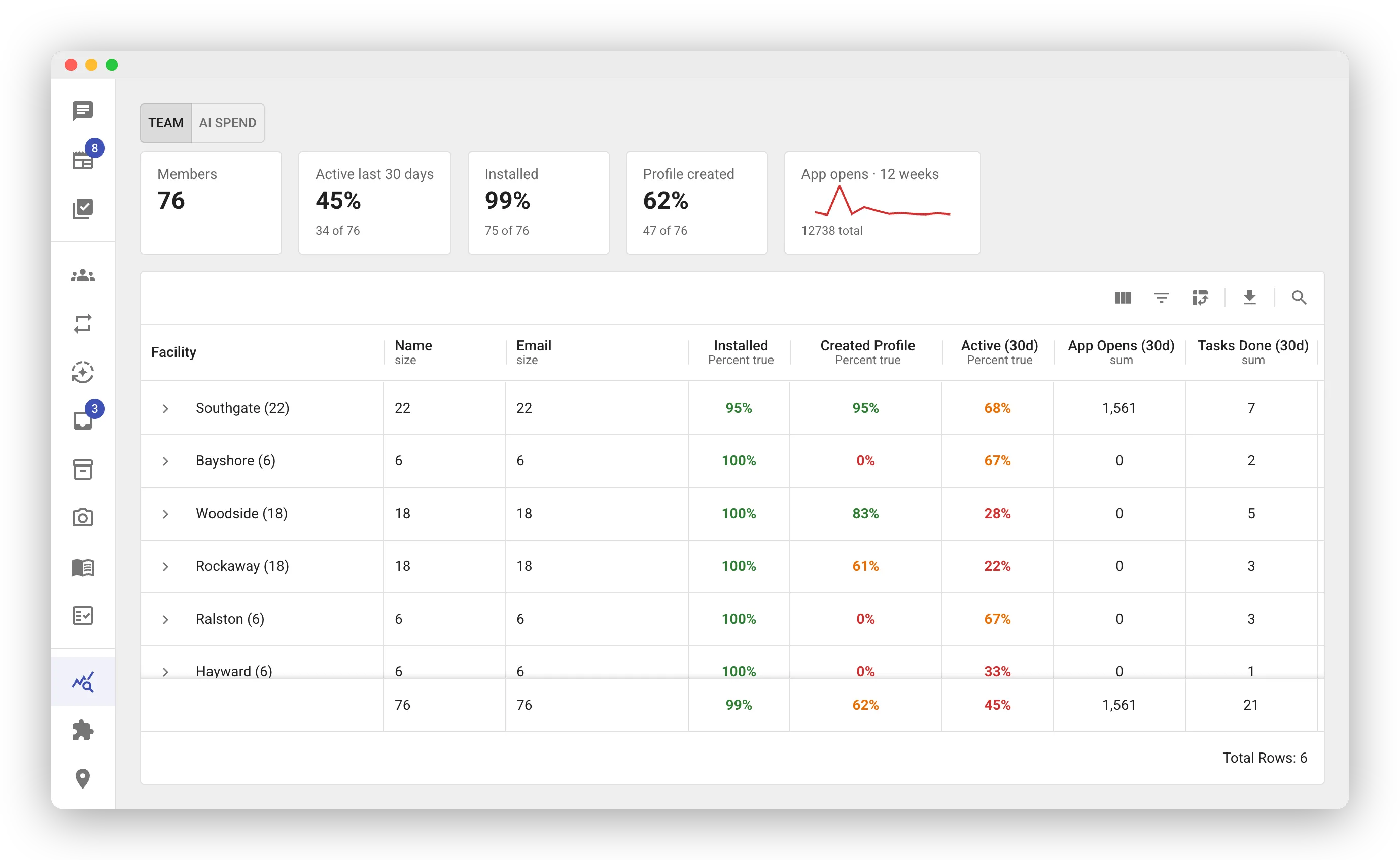
Use the grid to spot facilities that need help:
- Low install or profile rates — those people never finished setup. Check in with them.
- Low activity — the team may need training or a reminder.
The Weekly Report
Section titled “The Weekly Report”The Usage page is where you go look. The weekly report comes to you. Every Sunday evening, FastQuery posts each store’s week to its newsfeed. It also posts an executive summary across all stores to the Headquarters feed. Email delivery is optional. You configure it per facility on the Integrations page. See Weekly Reports.
Checking Your POS Sync
Section titled “Checking Your POS Sync”Looking for the last POS sync time? That lives on the Integrations page, next to the integration’s settings.